The Emotional Spectrum: How Colors Influence Our Feelings in Widowhood
Create harmony and more joy in widowhood; let color lead the way!
Healthy Widow Healthy Woman Podcast: Listen Here :)
We welcome to Healthy Widow Healthy Woman Podcast, Guest Sharon Hanby-Robie, Interior Designer, residential home décor on-air expert for QVC network., showcasing the latest in interior design and home fashion to millions of television viewers. She’s a member of American Society of Interior Designers (ASID).
For more than thirty years, Sharon has been combining her unique ability to see and combine color, along with her aesthetic vision for simple elegance, to professionally help families create homes that are exceptionally beautiful as well as functional. She takes great care in listening to client's hearts as they express their personal ideas to help them realize their dreams.
She is the author of many books including, The Simple Home: A Faith-filled Guide to Simplicity, Peace, and Joy in Your Home, My Name Isn't Martha, But I Can Decorate My home, and Decorating without Fear. Sharon's work has appeared numerous times on such highly-regarded television shows and networks such as The Today Show, HGTV, CBN, and DIY Network.
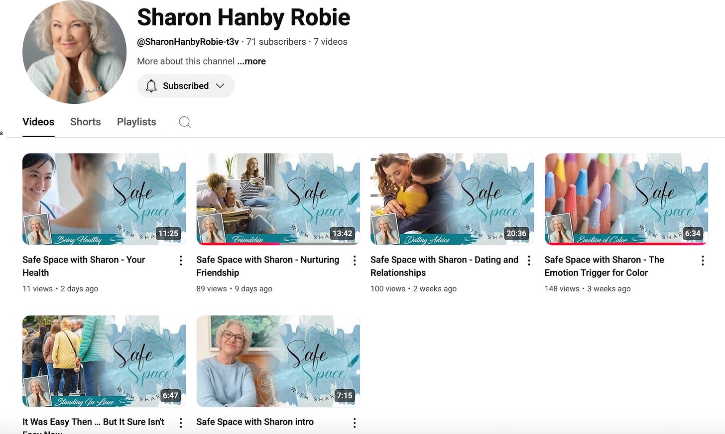
Her newest endeavor is on her YouTube Channel “Safe Space with Sharon”.
Color Therapy & Healing Spaces with Sharon Hanby-Robie
Sharon Hanby-Robie explores the transformative role color plays in the widow healing journey. Sharon reveals the deeply personal crisis that first connected her to the emotional impact of color, and how this awakening led to her groundbreaking "Safe Space with Sharon" approach to designing environments for those experiencing profound transitions and hoping to use color to better communicate themselves.
The conversation delves into specific colors that can help widows navigate overwhelming emotions and identity disruption—from calming blues that reduce anxiety to grounding earth tones that provide stability during life's most turbulent transitions. Sharon shares evidence-based insights on how our visual environment directly impacts our psychological wellbeing when grief has disrupted our sense of home and self.
Through touching client stories, Sharon illustrates how redesigning living spaces becomes a powerful metaphor for rebuilding life after loss. Hear the remarkable transformations. This episode offers practical wisdom for anyone seeking to create spaces that honor what was while supporting what can be.
The Emotional Language of Color: Designing with Feeling
Have you ever walked into a room and immediately felt different without knowing why? Or been drawn to a product on a shelf before you even knew what it was? Chosen a certain color for an occasion in fashion or jeweler?
The secret might be color—the silent communicator that shapes our emotional experiences in profound ways.
As designers, Sharon and I have discovered that color ranks as the one of the top emotional triggers we encounter, capable of instantly transporting us through feelings, memories, and connections that words often struggle to convey.
This isn't just aesthetic theory—it's neurological reality. When we experience color, our brains process it both visually and emotionally, creating immediate reactions that bypass our logical thinking. That soft blue ceiling isn't just decorative; it's creating a psychological experience of openness and calm. The vibrant red in that logo isn't random; it's deliberately sparking energy and passion.
Our lives are woven through with these color experiences. Remember the golden hour light that made an ordinary evening feel magical? Or how certain green tones instantly transport you to childhood summers? These aren't coincidences—they're the emotional language of color at work.
In my design practice, I've learned to listen to what colors are saying before deciding where they belong. Every shade carries emotional information:
Blues communicate tranquility and trust
Reds signal energy and urgency
Earth tones ground us with their comforting warmth
Yellows infuse spaces with optimism
But the most fascinating aspect is how deeply personal these connections can be. Cultural background, life experiences, and even geography all influence our color relationships. The colors that surround us become part of our emotional vocabulary.
On this week's podcast, we dive deeper into this colorful conversation. We explore how intentional color choices can transform environments, influence decisions, and create meaningful connections in both professional design and everyday life.
What colors speak to you most powerfully? Share your experiences in the comments—I'd love to hear how color has shaped your emotional landscape.
Today, I want to share a powerful example of this emotional language in action through the thoughtful color palette of Modern Widows Club®—an organization dedicated to empowering widows to thrive as they navigate their journey from grief to growth.


Keep reading with a 7-day free trial
Subscribe to Widow Life™ to keep reading this post and get 7 days of free access to the full post archives.


